BOOKING PLATFORM
Designed & implemented
new booking platform
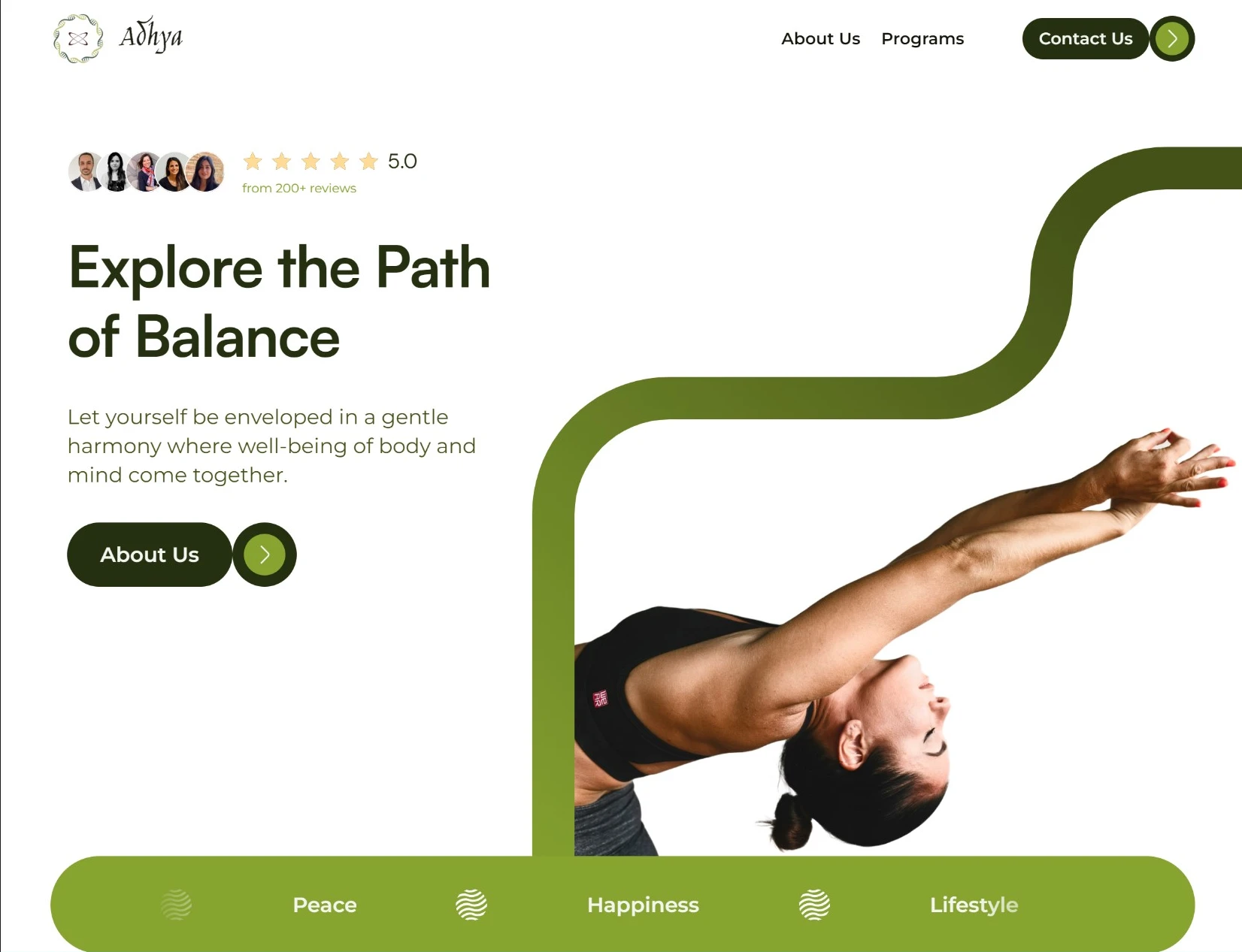

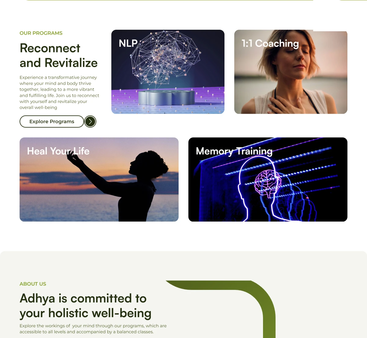
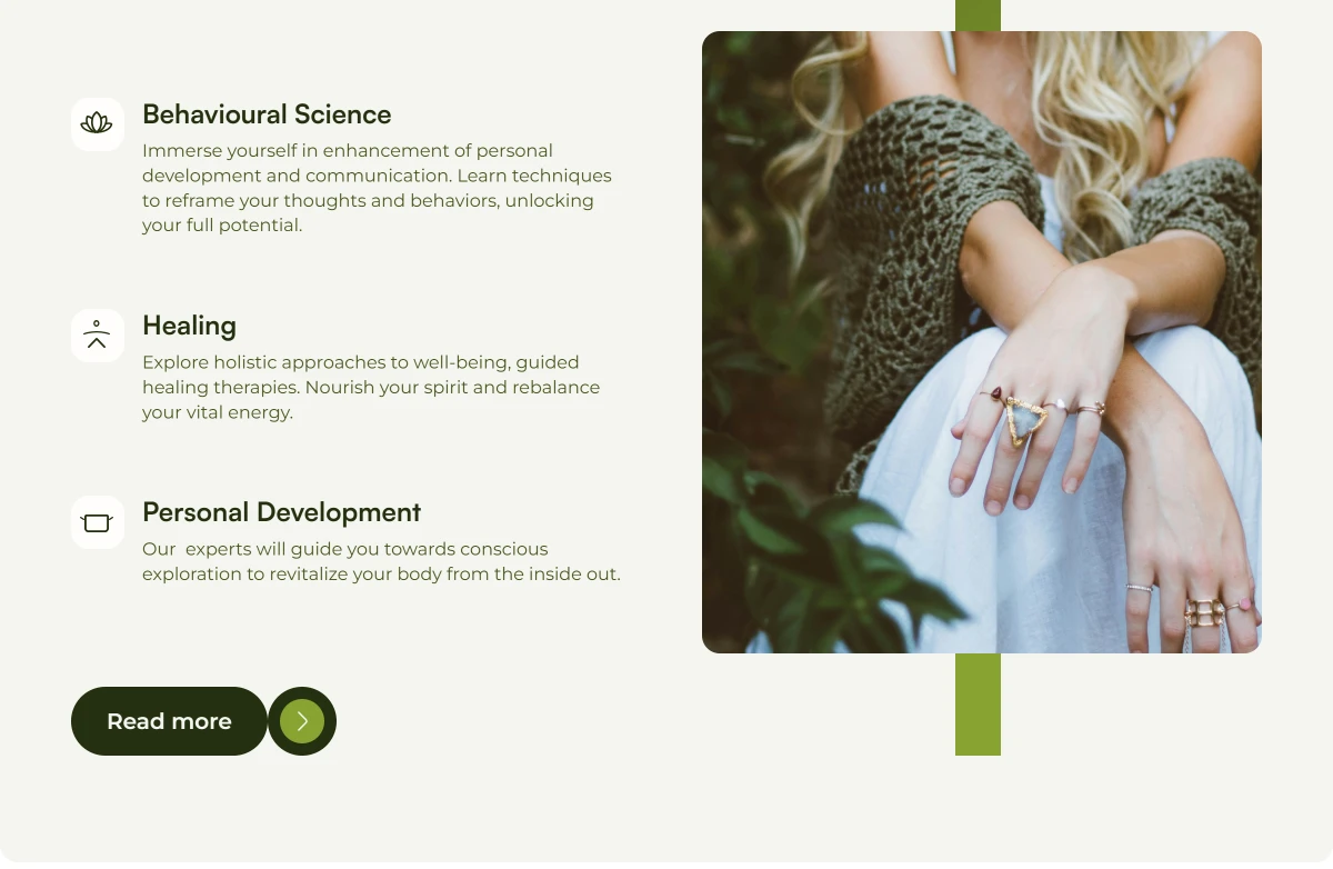
Adhya is a platform dedicated to exploring holistic beliefs, providing resources, and offering courses that help individuals connect with their deeper selves. The client sought a website to share and sell their programs, including NLP training and one-on-one coaching. They envisioned a site with earthy colors, particularly greens, to reflect their brand ethos.
Timeline
From explorations to final designs in 6 weeks while working with multiple projects at the same time
Objectives
Create a User-Friendly Website: Design a platform that allows users to easily explore and purchase holistic programs.
Reflect Brand Identity: Utilize earthy colors and natural elements to create a calming and inviting atmosphere.
Enable Content Management: Ensure the client can easily update and manage course offerings.
The client had a general idea of wanting a website but was unsure about the specific design elements and layout. Their primary requirements were:
A platform to showcase and sell programs.
A user-friendly interface that aligns with their holistic vision.
Flexibility to evolve as their offerings expand.
To address the client’s needs, I conducted:
Initial Client Meetings: Gathered insights about their vision and goals.
Competitor Analysis: Reviewed similar holistic websites to identify design trends and functionalities.
User Research: Considered potential users' preferences and pain points regarding online learning and coaching.
Design Process
This category details the step-by-step approach taken during the project:
1. Wireframing
I began with low-fidelity wireframes to establish the basic structure of the website, focusing on:
Homepage layout with featured programs.
Course details pages with clear calls to action.
An easy-to-navigate menu.
2. Prototyping
Next, I created high-fidelity prototypes using Figma. This included:
Interactive elements to demonstrate navigation.
Integration of earthy color palettes, focusing on greens and soft neutrals.
3. Client Feedback and Iteration
Due to the client's uncertainty about design preferences, we held several revision sessions. Key iterations included:
Adjusting layout based on client feedback to improve clarity and visual appeal.
Experimenting with different color shades and typography to find a harmonious balance.
4. User Testing
Conducted informal user testing with potential users to gauge initial impressions and usability. Feedback indicated:
Users appreciated the calming design and intuitive navigation.
Made changes in the user flow to make it better to navigate.
Suggestions for clearer calls to action on program pages.
Implementation
Utilizing Framer, I developed the website with features including:
E-commerce Functionality: Integrated a secure payment system for program sales.
Responsive Design: Ensured accessibility across devices, enhancing user experience on mobile and desktop.
Results
Successful Launch: After two months of collaborative work, we launched the website on 3rd Oct 2024.
Positive User Feedback: Initial user interactions reflected a high engagement level, with users appreciating the design and ease of navigation.
Challenges and Solutions
These are the some challenges faced during the project and their solution:
Challenge
The client’s unclear vision led to multiple revisions, potentially extending timelines.
Solution
Conducted focused workshops to clarify their goals and preferences, guiding them through design decisions while remaining flexible to changes.
Future Improvements
Content Expansion: Plan to add more courses and resources based on user interest and feedback.
Analytics Integration: Implement tools to track user behavior and optimize the website based on insights.
Conclusion
The development of adhya.framer.website was a fulfilling project that allowed me to merge design and functionality in a way that resonates with the client's holistic mission. By focusing on user needs and iterating based on feedback, I created a platform that effectively serves its audience and reflects the brand's identity.